
Role
Graphic Designer / Art Director — logo exploration, identity development, typography, and corporate stationery design.
Project goal
Develop a visual identity for ID Solutions, a law company, that could communicate professionalism and trust without becoming visually heavy or overly traditional. The project began with logo exploration rather than a predetermined symbol, allowing several very different directions to be tested before the identity was consolidated.
Creative and technical approach
The exploration moved between familiar legal references and more contemporary brand ideas: scales, heraldic structures, monograms, fingerprints, and reduced typographic marks. Looking at these alternatives side by side was an important part of the process — each route changed the balance between authority, individuality, and modernity.
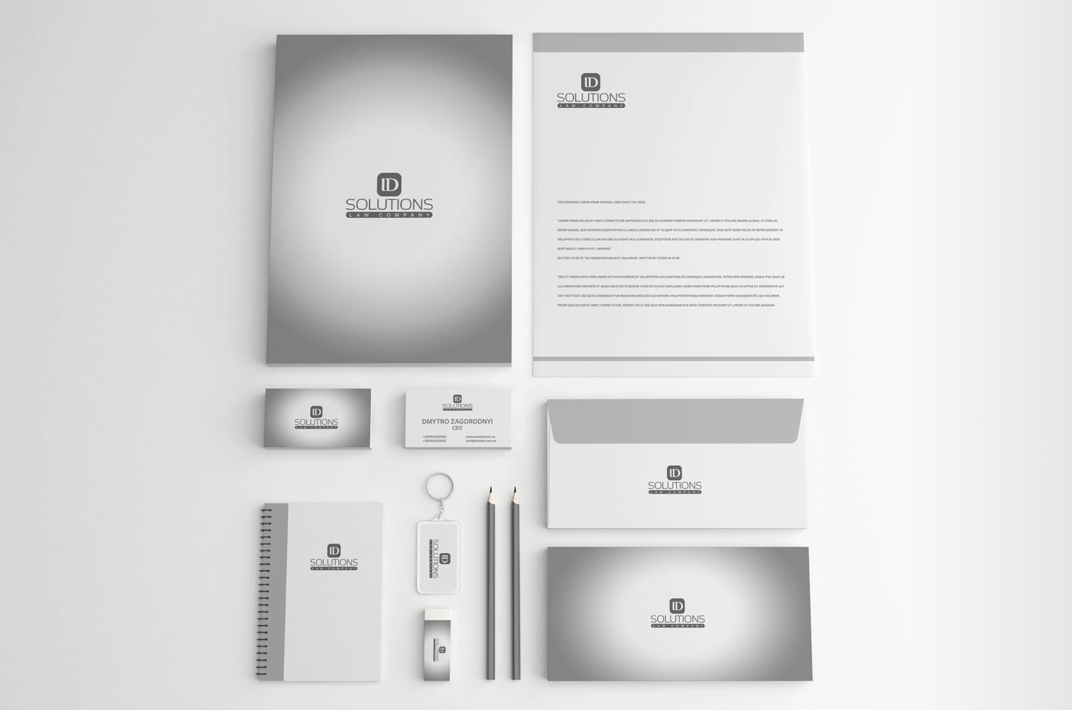
The selected direction was then extended beyond the logo into a restrained corporate system. Monochrome applications, generous white space, consistent typography, and simple stationery layouts allow the mark to remain central without making everyday business materials feel overdesigned.
Result
A complete identity study that shows both the final corporate language and the thinking behind it. Rather than presenting a logo as an isolated object, the project demonstrates how visual alternatives are evaluated and transformed into a coherent brand system.